TextField widget in flutter:
TextField is used to read user input text. This is a text box and if the user clicks on it, it opens the keyboard and focused on it. If the user starts writing, then the text is displayed in this widget.
Flutter provides TextField widget to create a text field and different properties to customize and change its behavior.
In this post, I will show you how to create a TextField in flutter and its available properties with example.
Basic example of TextField:
Let’s take a look at the below example:
import 'package:flutter/material.dart';
void main() {
runApp(MyApp());
}
class MyApp extends StatelessWidget {
// This widget is the root of your application.
Widget build(BuildContext context) {
return MaterialApp(
title: 'Flutter Demo',
theme: ThemeData(
primarySwatch: Colors.blue,
),
home: Scaffold(
appBar: AppBar(
title: Text('Example'),
),
body: Container(
margin: EdgeInsets.all(30),
child: TextField(
decoration: InputDecoration(
border: OutlineInputBorder(),
labelText: "Enter your Text"),
))));
}
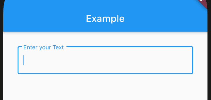
}It is showing a basic TextField implementation. We are using only decoration property to add outline borders and one label text.
It creates a material designed TextField as like below:
It follows the material design guideline. So, once activated, it looks as like this:
Properties of TextField:
TextField widget comes with different properties. Let’s take a look on these:
autocorrect -> bool:
define auto correction is required or not
autofillHints → Iterable
list of strings to help it identify the type of text input
autofocus → bool
Enabling it focus this TextField automatically
controller → TextEditingController
Controller for the editing text.
cursorColor → Color
Cursor color
cursorHeight → double
Height of the cursor
cursorRadius → Radius
corner radius of the cursor
cursorWidth → double
width of the cursor
decoration → InputDecoration
Decoration of the text field
dragStartBehavior → DragStartBehavior
Way to handle drag stat behaviour
enabled → bool
enable/disable this widget
enableInteractiveSelection → bool
enable/disable user interface affordances
enableSuggestions → bool
enable/disable input suggestion
expands → bool
change the widget height to fill its parent
focusNode → FocusNode
Defines keyboard focus for this widget
inputFormatters → List
input validation and formatting
keyboardType → TextInputType
keyboard type for the text field
maxLength → int
maximum number of characters in the text field
maxLengthEnforced → bool
setting it true will prevent the field from allowing more than maxLength characters
maxLines → int
maximum number of lines
minLines → int
minimum number of lines
mouseCursor → MouseCursor
cursor of the mouse pointer on hover
obscureText → bool
setting true will hide the editing text. Useful for creating a password textfield
obscuringCharacter → String
if obscureText is true, it defines the character to use for obscuring
onChanged → ValueChanged
Called when one new text is inserted or deleted from the textfield
onEditingComplete → VoidCallback
calls when editing is completed i.e. user clicks on the done button
onSubmitted → ValueChanged
calls when user completes the editing of the textfield
onTap → GestureTapCallback
calls on each tap, not for double tap
readOnly → bool
make the textfield readonly
restorationId → String
restoration id for saving and restoring the state
scrollController → ScrollController
Scroll controller for vertically scrolling textfield
scrollPadding → EdgeInsets
padding for a scrollable
selectionEnabled → bool
interective selection is enabled or not
showCursor → bool
show/hide the cursor
smartDashesType → SmartDashesType
automatically format dashes
smartQuotesType → SmartQuotesType
automatically format quotes
style → TextStyle
style of the text
textAlign → TextAlign
horizontal text alignment
textAlignVertical → TextAlignVertical
vertical text alignment
textDirection → TextDirection
direction of the text
textInputAction → TextInputAction
type of action button for the keyboard
toolbarOptions → ToolbarOptions
toolbar options
These are the mostly used properties in TextField widget. You can check all of them in the official doc


